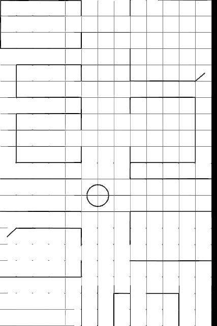
I started off by making a basic board that I wanted using Illustrator. The black band on the side of it is because I slightly miss calculated the size that I needed but that can always be cropped out later.
I then took the board and put it into photoshop and started playing about with various designs. The first one was a simple colour one using the colours I have used previously but after making the design, I felt that I used the colours in a wrong way and that there was nothing special about it.
I went in a different direction with the next part with the use of no colour but using grayscale instead. But again, I felt that colours were not just right but the board was a lot easier to see. The style of the board did not fit along with the other designs so far apart from the colours themselves.
I took the same brush as before in Flash and used it to trace around the lines in the same style as the previous designs.
I then went about trying to create the names of the different buildings which was the easy part. But the typography was not, I started off by using the flash tool to create my own hand written text but even when going through all the different colours, I could not get the exact style that I was looking for.
I started by trying MV Boli which had nice curves to it and not too straight but I felt that it didn't fit well with the theme that I was looking for, it was too straight
I then tried a very straight font, Vijaya set as I thought that it would give a very good and clear contrast. It wasn't what I expected and was very different but didn't bit in with the theme at all.
I finally found Segoe Script, it had a lot of curves and fitted in well with the hand drawn style but still kept it easy to read.
After I got the typography and layout down, I started adding in the colour that I looked at earlier and bound that the blue worked well, it was not too dark as to impair the grids but I still had to turn the opacity down in order for the grids to show up more clearly.
The final thing that I needed to add to my board was small icons for when you would draw a card or take an action on those points. I played about with different designs for maybe different cards and in the end chose two that would be an encounter icon and another that would be the objective, the wine and the sword would be both encounter icons maybe giving different awards such as supplies and weapons and the treasure chest would be the objective marker. I decided to add in the bomb as well as an equipment card, thus making 3 different cards to choose from on the board.
My final design for the board game with all the icons. However, I feel that the icons are a little too strong.
I turned down the opacity on the icons to 41% and it helped the effect of the board, the icons no longer popped and made them seem more in the background as they are meant to be.
I feel the final design is good. It shares the same effect as the character designs so far and I hope to be able to carry on these designs to the card designs.
I feel the final design is good. It shares the same effect as the character designs so far and I hope to be able to carry on these designs to the card designs.


No comments:
Post a Comment